We currently live in a world almost completely devoid of sports. With nothing but uncertainty on the horizon, six NFL franchises have managed to keep fans talking by unveiling new uniforms.
Sure, these franchises have the best intentions and fans of these specific teams are chomping at the bit to use the fire emoji while retweeting these photos. Unfortunately, many of these unveilings went over about as well as a sneeze in a nursing home.
New NFL uniforms ranked
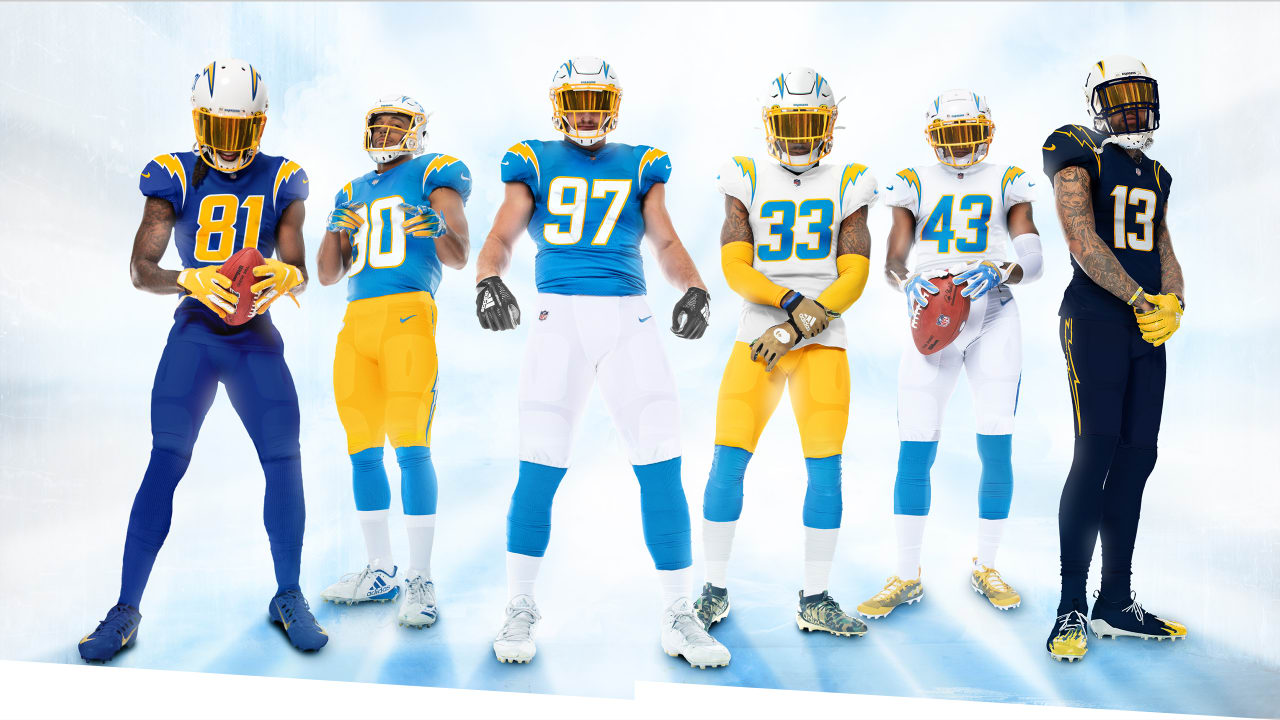
1. Los Angeles Chargers
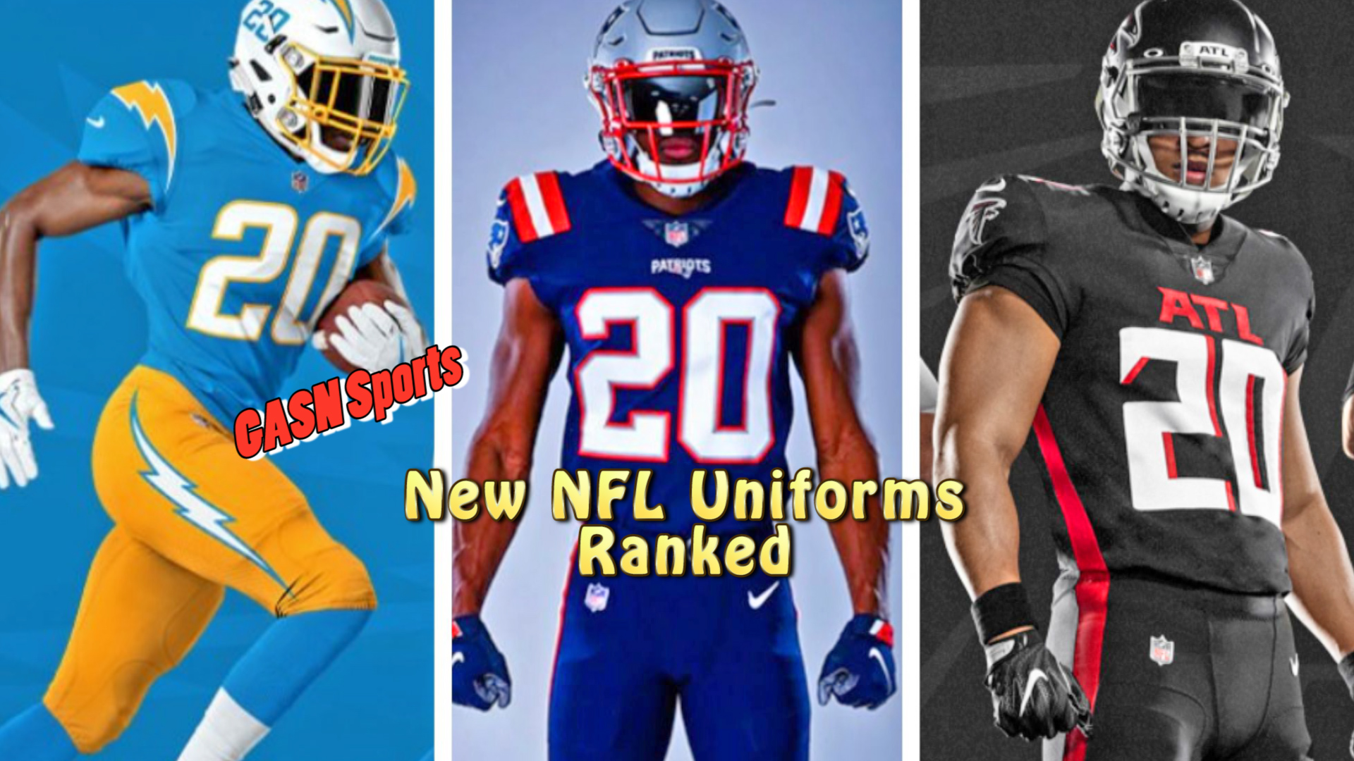
Yep, these were the clear darlings of the off-season. Really, they are just adding more alternates to what they already have and while it’s good to see a nod to the Seau-era navy’s, it falls a bit short without the matching helmet. Sports fans are suckers for anything powder blue and the team did a solid job here appeasing fans of all areas of Chargers history.
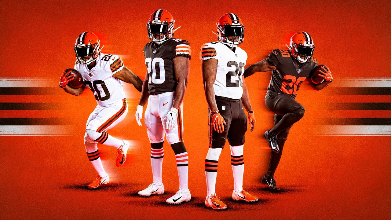
2. Cleveland Browns
What’s the old saying…What’s old is new again? Many people are raving over the Browns’ attempt at at reliving the Bernie Kosar years, but the truth is, the Browns are the proud owners of the worst colors in all of sports and have made the playoffs once in twenty years. Their last redesign was so putrid (see Tampa Bay below) that they are actually being given credit for erasing that memory.
3. Tampa Bay Buccaneers
We get it, Tom Brady is there now and it was time to move on from the awful, gaudy look that was forced on us a few years back. These represent the only proud portion of Bucs history but the question remains: where is the creamsicles and why am I looking at a charcoal on charcoal…on charcoal option?
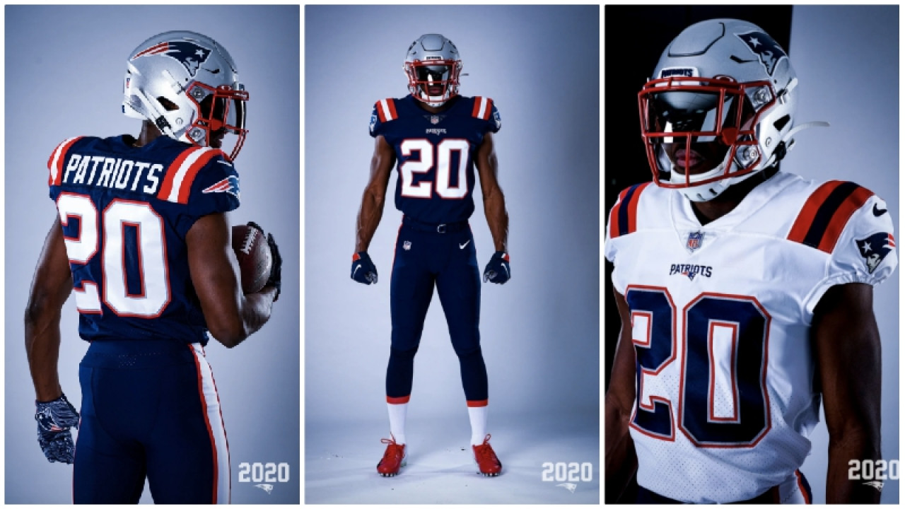
4. New England Patriots
The grey pants are gone and we’ve added a completely unnecessary stripe on the shoulder pads. This seemed like a GREAT opportunity to go back to the white helmet even if you didn’t want to bring back Pat the Patriot. There’s just nothing that stands out about these and begs the question why a change occurred in the first place?
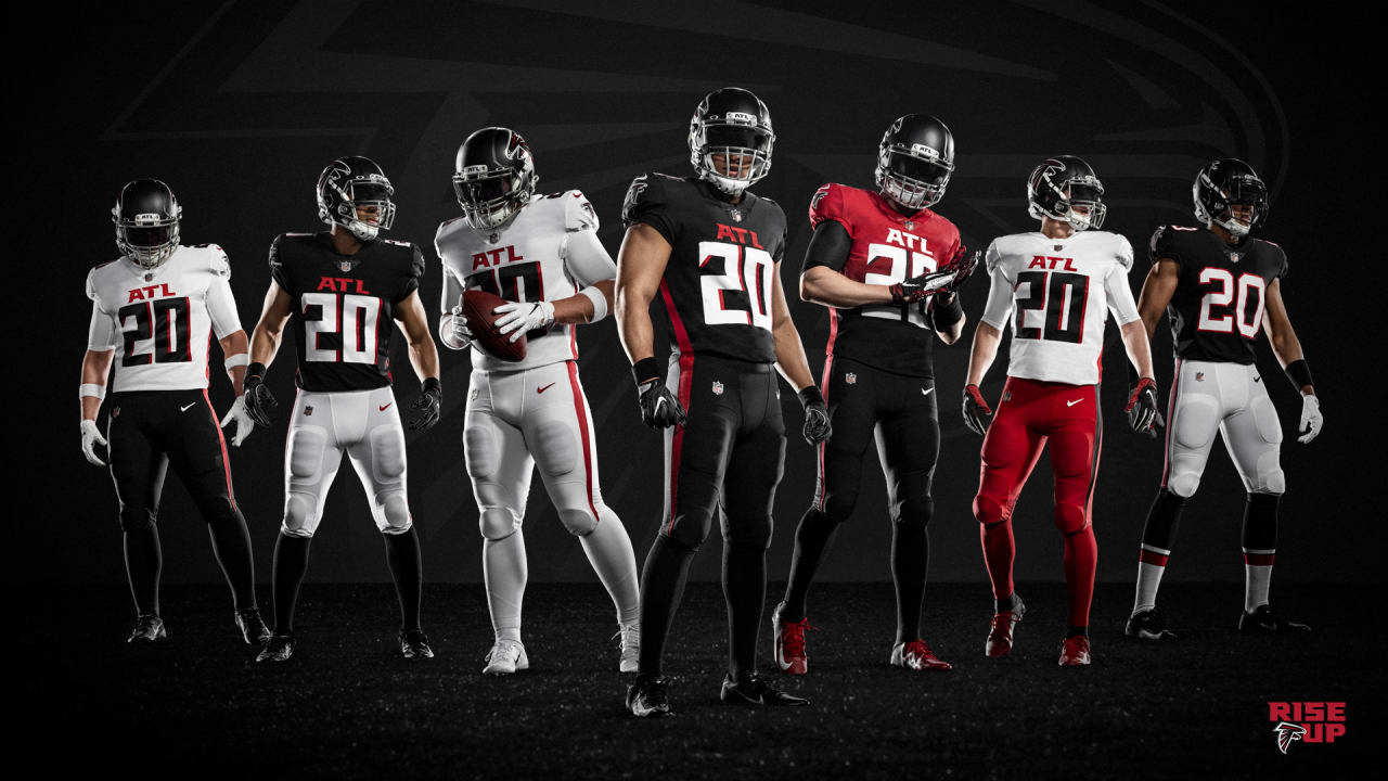
5. Atlanta Falcons
The reviews are in. These plain-jane’s were a futile attempt at best. The Falcons have a great color palette to work with and churned these out? From the self-indulgent ATL on the front to the one red jersey that appears to bleed into black, this doesn’t seem like a set of uniforms that will have a long shelf life.
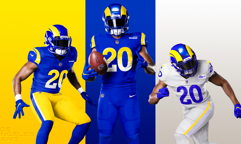
6. Los Angeles Rams
The term “bone-on-bone” has pretty much ruined me forever as a uniform junkie and the internet jokes have been flying fast and furious since these were released on Wednesday. Former Ram and Hall-of-Fame running back Eric Dickerson couldn’t even hide his disdain saying that they look “soft” and that the Rams stripes look like “two bananas.” The road uniforms are among the worst ever seen by human eye while the home threads are, at least, serviceable.
Apparently, without anyone knowing, the Indianapolis Colts changed their number font and added an awkward looking alternate logo,

Why is it that people question the Bucs not coming out with creamsicles when it’s been explained time and time again?! The helmet rule will be changing next year where it will then be possible for them to have a secondary helmet, which in turn will allow for the creamsicle uniforms. I don’t think they have the best new unis because it is just the same as the late 90s with a slight modification here and there.. but at least the pewter ones are fresh and new. Aside from that.. am I the only one who doesn’t understand the love for the Browns uniforms? Nothing they presented was new nor is it appealing. It’s literally the exact same as their prior ones and just plain boring. It’s not like they had long winning history behind them. The Patriots basically made their color rush ones the “new ones”.. and the Falcons we can all agree are just awful. The Rams honestly aren’t great but I give them credit for having the drastic change and it not looking horrible. I think in time people will come around for them. My ranking:
1 Chargers
2 Bucs (maybe I’m bias)
3 Patriots
4 Rams
5 Browns
6 Falcons