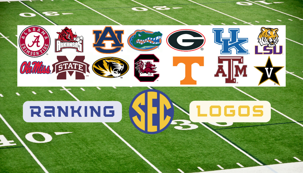
The SEC is a conference rich in tradition and winning! The powerhouse conference of college football houses the nation’s most dominant programs. Each of those programs is proud of their logo and the history behind it. We will rank each logo from 1-14 but each of them is a sleek and well thought out brand for their university!
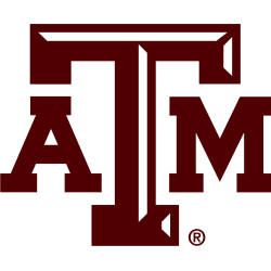
14. Texas A&M
It’s maroon letters, sorry.
13. Ole Miss
This will be a theme where letters and writing won’t earn you a top spot! We do like the font though.
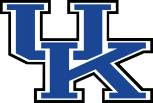
12. Kentucky
The style and font keeps Kentucky out of the cellar!
11. Tennessee
We love the orange, but it’s just the letter T.
10. Georgia
The red outline and look of the G puts this higher than maybe it deserves.
9. Mississippi State
Finally a letter with a little pizazz as they are Hail State!
8. Vanderbilt
This Vanderbilt rebrand is as drab as its athletic department, but it does pay homage to their star walk!
7. Alabama
The classic script A, but we need a little more here.
6. Auburn
We love the color scheme and the style of the AU overlapping!
5. South Carolina
A mascot vaults the Gamecocks up the list, but the maroon stops them at 5.
4. LSU
Purple and yellow along with the Tiger always make LSU a strong choice!
3. Mizzou
Black and gold are powerful colors especially with the intimidating tiger!
2. Arkansas
The Razorback is always a fan favorite and you know it’s time to call the hogs!
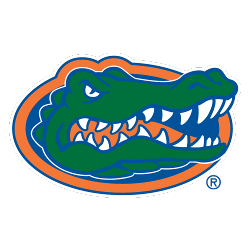
1. Florida
Blue and orange with the green Gator just simply can’t be beat! The best color scheme in all of sports for our money!
Kansas City based media outlet covering sports on a national and local level. From breaking news to podcasts and live shows, Starcade Media continues to thrive as an industry innovator.